
Most ecommerce websites treat the mobile view of their website as a less featured version of the desktop view. It starts mobile-first with the minimum of features and then the features add up when the screen gets bigger.
What should be done instead is having a base design, a minimal subset of features that will be kept on mobile and desktop and on this design we will add mobile related features for mobile view and desktop related features for the desktop view.
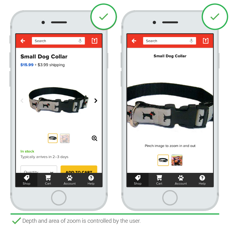
Vital site functionality shouldn’t be hidden behind a burger menu, but instead it is a good idea to have it as buttons on top or at the bottom of the page. Also, because the page is much smaller, it is helpful to be able to zoom in to view photos of the product:
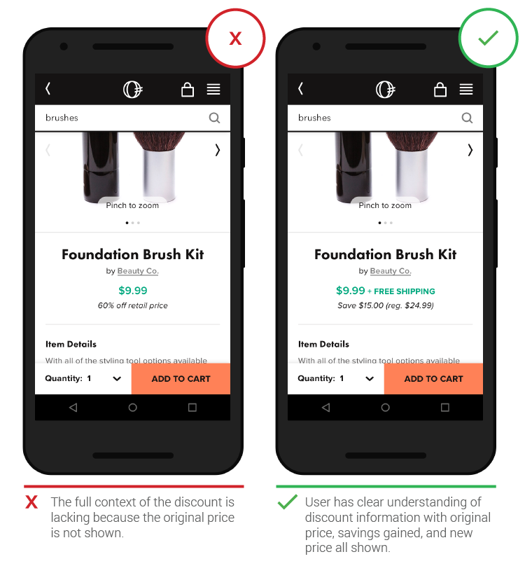
Another useful information for the user, but that I don’t see it much on ecommerce websites is the exact discount information. It is not enough to say 15% off. It is better to say that on this product you save £6:
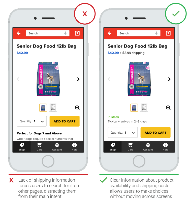
If possible it is useful to provide the shipping information on the product page, like in how much time the product will be shipped and how much it will cost (from the user’s location if it is shared or your main shipping country):
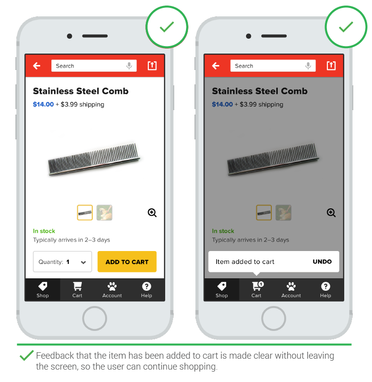
After an action has been done, like product being added to cart, don’t redirect to another page, instead let the user continue shopping:
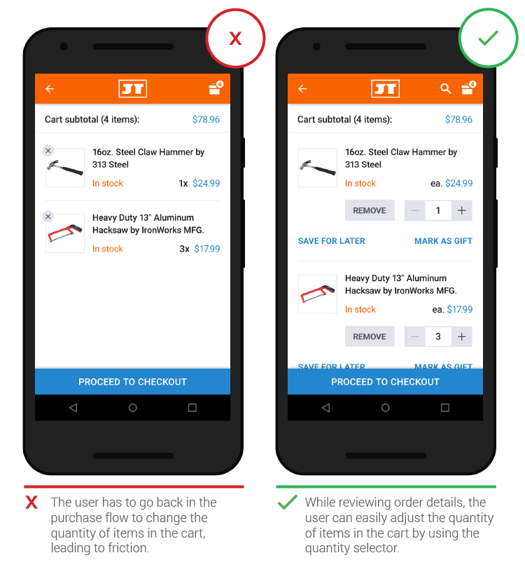
Extra information on the cart page and checkout is always useful. It helps if the website can provide as much functionality as possible, like wishlists:
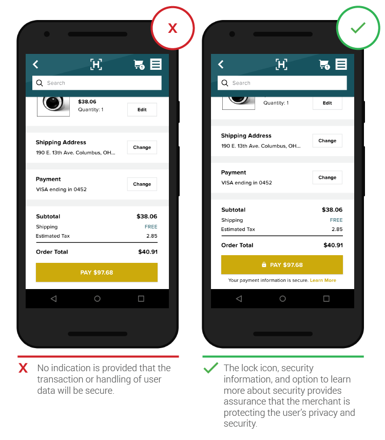
Don’t assume that the customers know that your payment gateway is secure, it is better to inform them and have a link where you provide more information:
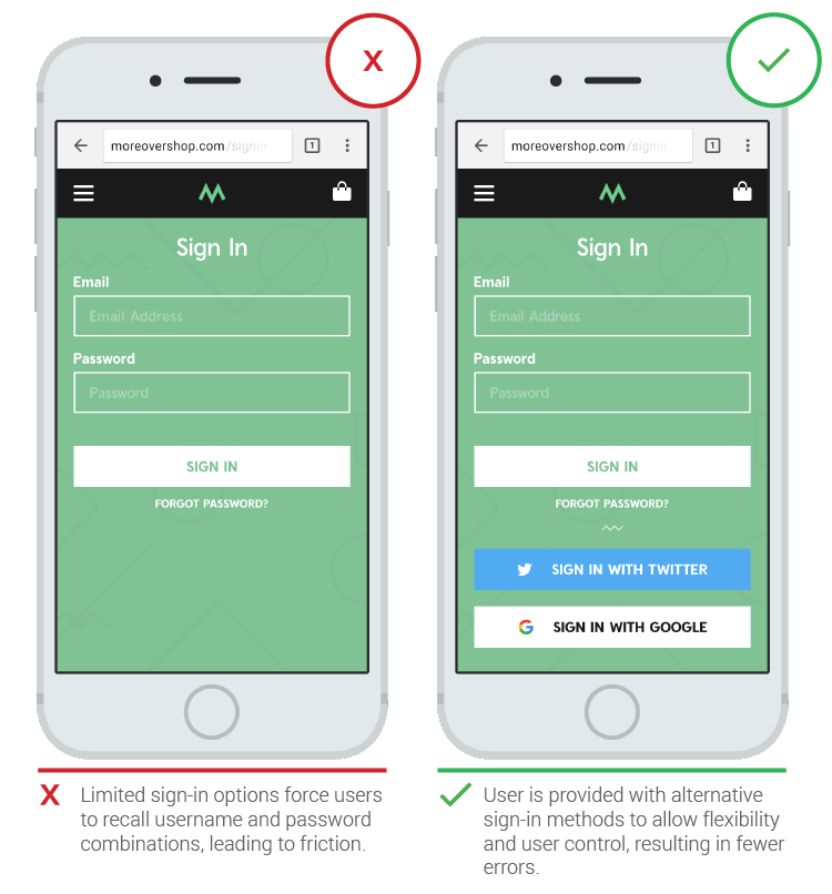
Creating new accounts on mobile is hard and time wasting. It is better to provide options to use google, facebook and twitter logins:
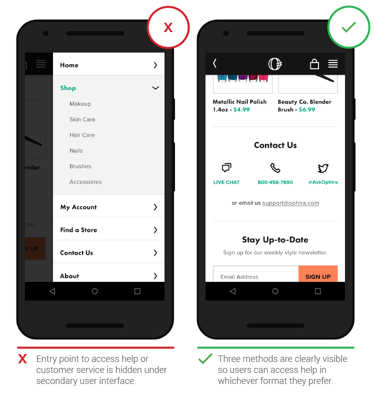
Users tend to look at the bottom of the site when searching for help. Providing call information and email are good options, as is providing customer chat:
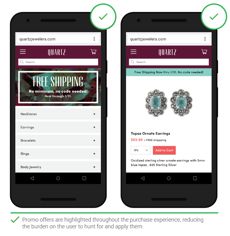
If there are ongoing sales and discounts it is better to reiterate these at every possible point in the shopping experience so that customers don’t have to look back for them:
Don’t forget to track changes made in your mobile design with tools like Google Analytics to see how conversions are affected.